Redesigning the Netflix Details Page
The problem
The Details Page is where viewers decide what to watch — it's the most visited page on Netflix TV, appearing in 77% of sessions. Despite its importance, the page hadn't evolved alongside the breadth of content Netflix now offers. I led the content strategy for this, and worked with multiple stakeholders in creating a framework that worked across a growing range of content types: movies, shows, live events, games, and more.
The existing Details Page was built over a decade ago for a much simpler content catalog. As Netflix expanded into live events, games, and episodic formats, the experience struggled to keep up, limiting how effectively we could surface information that helps viewers confidently decide what to watch.
Key actions like “Add to My List” were pushed below the fold, and there wasn’t enough flexibility to highlight richer, more relevant context without overcrowding the layout. We also lacked ways for members to express more nuanced intent—such as following a title, setting episode reminders, or marking something as watched. Overall, the page was functional, but no longer supported the type of information the modern catalog required.
But first, research!
We knew we needed to redesign the page to support business needs, but also wanted to understand what wasn’t working for users today. Across research sessions, a few clear themes emerged:
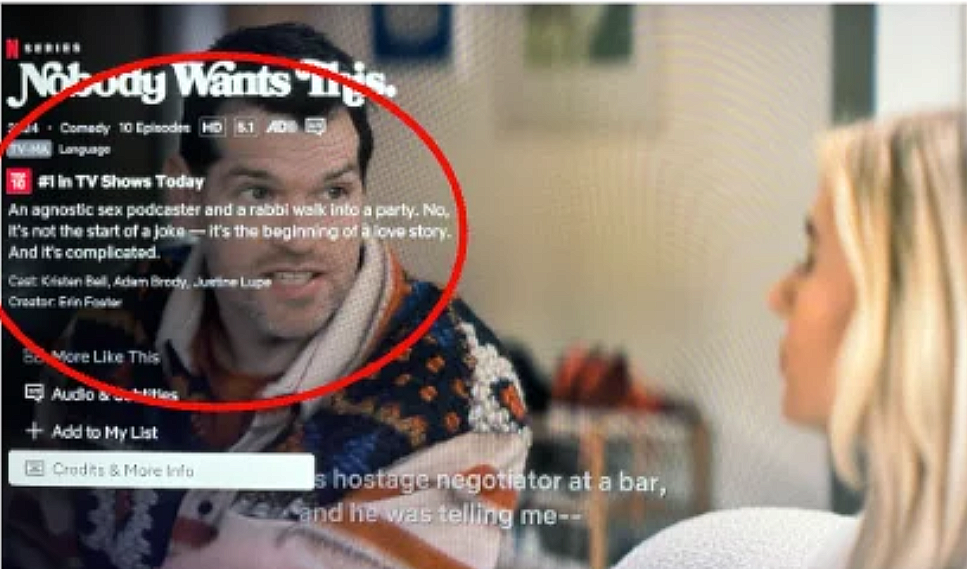
Viewers didn’t want key information obscured by on-screen text (as shown on the right). They relied on the background video to gauge things like genre, tone, or production value before deciding to watch.
Navigation and labeling also felt unclear, especially around trailers. Since trailers are a key decision-making tool, users often had to guess whether they lived under Episodes & More or Credits & More Info.
We also saw friction in how language was surfaced. To find a title’s original language, users had to navigate into Audio & Subtitles and scroll past multiple subtitle options, making something relatively simple feel unnecessarily buried.
Finally, important actions were easy to miss. Core sections like Audio & Subtitles and Credits & More Info were hidden below the fold or required extra clicks, making discovery harder than it needed to be.

TV Shows
This shows how all the components come together for a weekly live event.
Gathering stakeholder & cross team feedback
Because the Details Page supports nearly every Netflix vertical: games, live content, series, movies, and more, we partnered with cross-functional teams to understand their specific needs and requirements.
We shared a proposed framework for the redesigned experience and asked each team to stress-test it against their own content types and use cases.
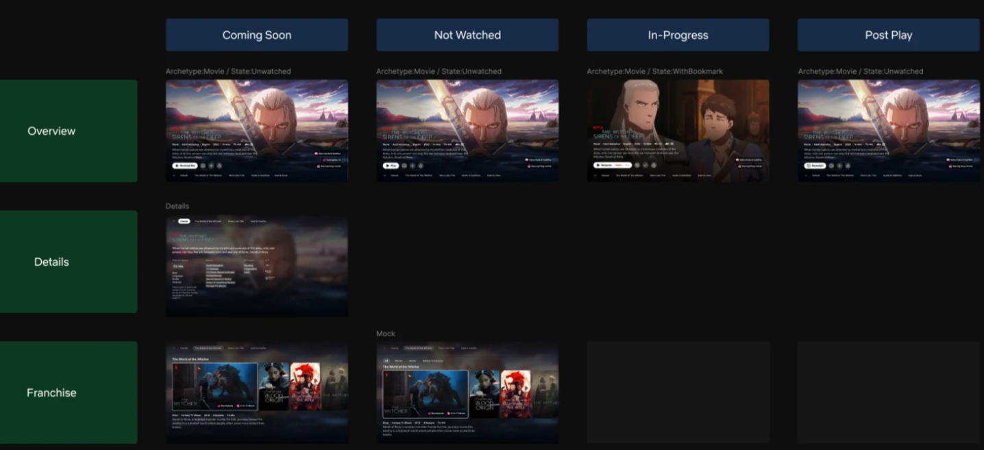
To the right, you’ll see how we asked our partners on the games team to consider each availability state and what information we’d need to show there.
Creating the framework
The examples below show how the framework adapts based on a title’s availability and the user’s viewing context. I defined logic and rules to ensure the most relevant information is surfaced at the right moment, depending on where the user is in the viewing journey.
TV shows
TV Shows
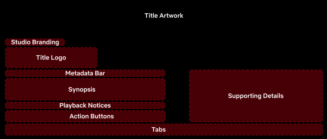
We landed on an information architecture supported by a modular framework. The components are made up details we knew were high priority in helping viewers confidently decide what to watch.
This structure allows us to surface richer details when needed, give priority to the most important information and actions, and avoid obscuring title artwork—while keeping the experience adaptable across different content types.
Examples of how the content flexes depending on availability state
Based on viewer and stakeholder needs, we defined a framework centered on a few key priorities:
Supporting richer, more contextual details about a title—including content type, state, and other relevant metadata—without compromising the core visual experience. On the existing Details Page, for example, longer synopses often overlapped or obscured artwork, limiting how effectively information could be surfaced.
Enabling clearer expressions of intent as Netflix becomes more personalized. This includes actions like “Add to My List” and following a title, giving viewers more ways to engage beyond a single watch decision.
Ultimately, the goal was to create a flexible system that can scale across evolving content types while maintaining enough consistency for viewers to build familiarity and navigate the intuitively.
TV Shows
TV Shows
TV Shows
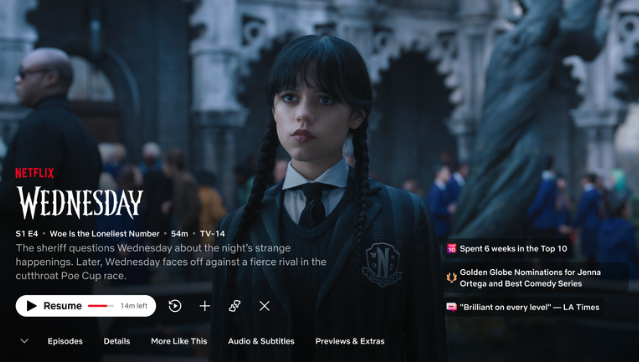
State - Continue watching
Metadata shows episodic details (season/episode #, synopsis)
CTA prompts to “Resume”
TV Shows
TV Shows
TV Shows

TV Shows
TV Shows
TV Shows
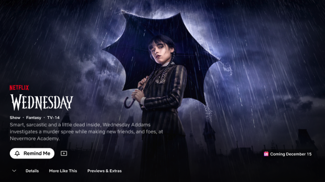
State - Coming soon
CTA encourages user to set reminder
Tabs at bottom prioritize trailer
Highlight release date
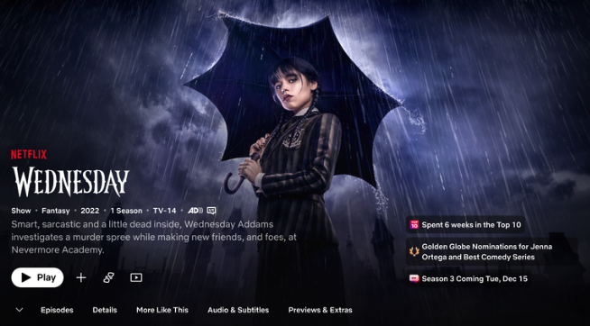
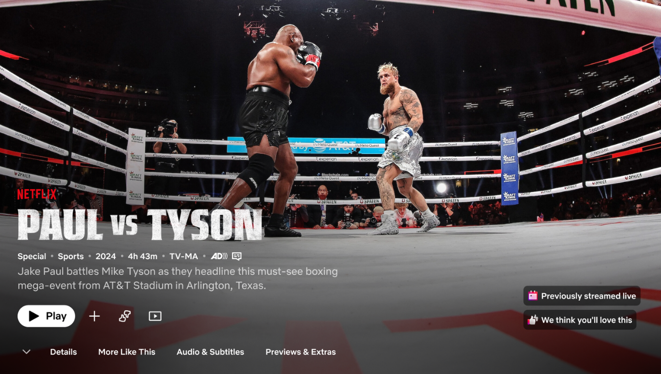
State - Available now
Metadata shows genre, release date, duration
CTA updates to “Play”
Tabs now update as full season is released
Highlight critical acclaim, popularity, and next season release
Live content
TV Shows
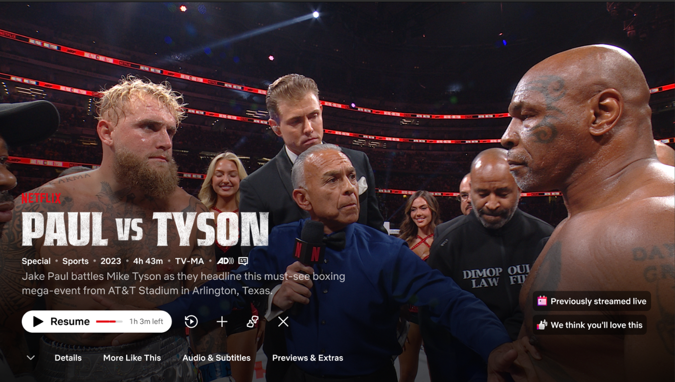
State - Continue watching
Metadata shows genre, release date, duration
CTA prompts to “Resume”
State - Coming soon
CTA encourages user to set reminder
Countdown builds anticipation
State - Available now
CTA updates to “Play”
Highlight personalization